
Typography
- Ethen Dent

- Oct 28, 2021
- 1 min read

"Bad typography is everywhere. Good typography is invisible."
The 7 Essential Elements
Typeface: Seriff, Sans-Seriff, Script, Decorative.
Hierarchy: Size of the text dictates hierarchy.
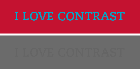
Contrast: Lots of contrast gives impact.
Consistency: A consistent typeface looks professional and clean. Inconsistent typeface looks messy.
Alignment: Visually link things together by aligning them.
Whitespace: typeface density can determine how legible a text is.
Colour: Hue (dominant wavelength), saturation (strength of the hue), value (lightness/darkness).


Other Elements
Different weights: for emphasis, legibility.
Small caps: Fake small caps have unbalanced spacing. Real small caps are spaced correctly.


Reflection Segment
"One concept that was brought up within the session was taking the name of the business idea and displaying them in various fonts and analyzing them. Identifying what works about the font. Does it look pleasing? Does it make sense? Does the typography effectively tell the viewer what the brand is about?"
"Following up on this exercise will take all the guess work out of the choice of typography. Obviously, a bad typeface is going to reflect negatively on the brand. But I'm unsure how much work I need to put into the typography to just make the business work."
Citations
Ward,C.,2016.Good Typography Is Invisible, Bad Typography Is Everywhere.[image] Available at:<https://simplyadtype.wordpress.com/2016/03/01/good-typography-is-invisible-bad-typography-is-everywhere/>[Accessed 12 November 2021].What I've been listening to:


Comments