

A2 Media Studies Archive


Role
Student
Produced
SEP 2016
Project Type
Coursework and Research
Location
Dover Grammar School for Boys
Description
An archived version of my A2 Level Media Studies coursework and research, conducted at DGSB.
INTRODUCTION

I've decided to bring my A2 level media studies work into my main portfolioas a way of preserving a body of work that documents a much earlier stage of my creative journey.
This content was originally housed on my old Weebly website, bringing together my research into film and media, a series of vlogs and my and my peers' productions.
This blog post / archive serves as a preservation of the work conducted as it was originally created. I have only placed it within my wider creative portfolio.
note: some content is unfortunately lost to time and is non longer accessible. The original Weebly website can be found with the link below:
RESEARCH
PRE-LIMINARY TASKS - EXPERIMENTATION
(Task 1.1)
[Song Name: The Hiatus by Cappa Regime]
[Song Name: Harlem Shake by Baauer]
[Song Name: Surrender by Cash Cash]
[Song Name: Awake (feat. Colordrive) by WRLD (Monstercat EP Release)]
[Song Name: Georgia by Vance Joy]
[Song Name: Busy by Olly Murs]
VLOG NO.1
(Task 1.2)
Reverse Vlog
Dance Sequence Vlog
Speed Up / Slow Down Vlog
Pixelation Vlog
Lip-Sync Vlog
Opening 30 Second Remake Vlog
GOODWIN'S ANALYSIS
(Task 1.3)
Relationship between the lyrics and the visuals, which illustrate, amplify or contradict the lyrics.
Thought beats: seeing the sounds (the relationship between the music and the visuals, which illustrate, amplify or contradict the music).
Genre-related and iconography present. The concept and narrative of the music video relates to the corresponding genre.
Voyeurism – The audiences' perception of explicit content consisting of (not limited to): Nudity, exhibitionism, intimacy, voyeuristic location, behaviour in a sexual manner, etc...
Star Image – the reference of the protagonist in which the star image is portrayed as a vital aspect of the music video. This assists the artist to promote the artists image and reputation to the public whilst promoting the video.
Intertextual References either to other music videos or to films and TV texts.
Lyrics
I'm so alone,
Nothing feels like home.
I'm so alone,
Trying to find my way back home to you.
I'm so alone,
Nothing feels like home.
I'm so alone,
Trying to find my way back home to you.
I'm so alone,
Trying to find my way back home to you.
I'm so alone,
Nothing feels like home.
I'm so alone,
Trying to find my way back home to you.
I'm so alone,
Nothing feels like home.
I'm so alone,
Trying to find my way back home to you.
I'm so alone,
Trying to find my way back home to you.
Structure
Intro 0:00 – 0:20
Bridge 1, 0:20 – 0:33
Verse 1, 0:34 – 1:14
Chorus 1, 1:14 – 1:41
Break, 1:41 – 1:55
Bridge 2, 1:55 – 2:08
Verse 2, 2:09 – 2:49
Chorus 2, 2:49 - End
Chase and Status Analysis
All Goes Wrong by Chase and Status:
https://www.youtube.com/watch?v=hkDGGsuVKVo
Structure
Introduction, 0:00 – 0:23
Verse 1, 0:23 – 0:44
Chorus 1, 0:44 – 1:08
Verse 2, 1:08 – 1:41
Chorus 2a, 1:41 – 2:04
Chorus 2b, 2:04 – 2:26
Break, 2:26 – 2:48
Resolution, 2:48 - End
Lyrics
Would you take a bullet?
Would you bite the gun?
I fall onto my knees,
and yes the war's already won.
So please don't take me for no fool,
Spend a lifetime in your shoes.
And now I'm walking.
Yes, I'm walking.
Through the fire, I'll keep burning on.
Will I hold myself together?
When it all goes wrong.
The fires, they keep burning on.
Will I hold myself together?
When it all goes wrong,
When it all goes wrong,
When it all goes wrong,
I'll take my time, I'll keep holding on.
When it all goes wrong,
When it all goes wrong,
When it all goes wrong,
I'll pull myself together, keep on holding on.
Gloves off, we're finished.
You better hang your feets.
I nurse your battle scars but you leave,
My heart's a-bleed.
So please don't take me for no fool,
Spend a lifetime in your shoes.
And now I'm walking.
Now I'm walking.
Through the fire, I'll keep burning on,
Will I hold myself together.
When it all goes wrong,
When it all goes wrong,
When it all goes wrong,
I'll take my time, I'll keep holding on.
When it all goes wrong,
When it all goes wrong,
When it all goes wrong,
I'll pull myself together, keep on holding on.
Just like I take my faints,
You keep playing the same old games.
But remember,
But remember, oh no.
Through dark nights,
We burn bright,
'Til the sunset,
'Til the sunset.
Through dark nights,
We burn bright
'Til the sunset,
'Til the sunset
Through dark nights,
We burn bright,
'Til the sunset,
'Til the sunset.
When it all goes wrong
Through dark nights, (When it all goes wrong)
We burn bright, (When it all goes wrong,)
'Til the sunset, (I'll take my time,)
'Til the sunset. (I'll keep holding on.)
Through dark nights, (When it all goes wrong,)
We burn bright, (When it all goes wrong,)
When it all goes wrong,
I'll pull myself together, keep holding on.
Andrew Goodwin Analysis
Throughout the song, their isn't many occurrences in which the lyrics have a direct relationship with the visuals. It can be interpreted that some of the connotations of the lyrics can act as a contradiction to the visuals (fire connotes to passion and death results a loss in said passion.[“I'll keep burning on.”; this quote contradicts with the ideologies of death]). However, the lyrics within the chorus portrays an illustration of the visuals. The repetitive; “When it all goes wrong”, illustrates the events of the narrative as well uses emotive language (“all”, predominately carrying most of the emotional 'weight' [however, the way the phrase is pronounced emphasises the emotive language]). The events portray various negative events consisting of physical abuse, verbal abuse, theft, relationship break-down and death (all of which happen in a short amount of time).
The instance where the lyrics state; “Through dark nights, We burn bright”, can be perceived to be another illustration of the visuals. The phrase acts upon morals which convey dark nights as difficult times and burn bright as persist with optimism. This could be interpreted as a contradiction to the initial lyrics up to Chorus 2b as the events are reversed and the lyrics also serve as an illustration post-Chorus 2b as the events are shown in a different manner which can be considered positive. However the music video returns to the initial shot with the main protagonist within the coffin.
Within the music video there is few aspects visible in terms of the music. In the duration of the verses, the shots occasionally change in-sync with the percussive instrumentation which is conventional among music videos. However, the music video does not consist of a satisfactory amount of instances to apply any illustrations to the music.
This music video breaks predominately all of the genre-related conventions in consideration that 'All Goes Wrong' is applied as an Electronic/Dance song. Fast cut shots in time with the percussion is very limited in consistency throughout the music video showing that the music video diverts from most of the conventions. However, there are examples of close up shots to present the individual roles within the music video (conventional among Dance music videos). The music video's location is set predominately set in three locations; a churchyard, a cafe and the streets surrounding that cafe. This can be interpreted to break the conventions of a lively atmosphere expected in most dance music videos.
Star image is conveyed very subtly within this music video. The artists, Chase & Status, play filler characters acting within the background. This does present their image, but it can be easily missed if the audience is unaware to the artists appearance. It could be interpreted that the repetitive use of the artists to act multiple roles conveys a stronger use of star image and promotes their image easier, however the featured artist portrays his image further than Chase & Status. Tom Grennan, the featured artist for the song, is the main protagonist within the music video and is predominately the main promotion of his star image rather than Chase & Status. His image is conveyed in different ways to represent by formal and informal images in which could be interpreted that his music isn't specific to one genre.
(Something in the water [live]) – https://www.youtube.com/watch?v=fjDKC4YGSdl


ARTISTS COMPARISON LINO
(Task 1.5)

ARTISTS RESEARCH INFOGRAPHIC
(Task 1.6)
VLOG NO.2
(Task 1.7)
PRE-PRODUCTION
INDIVIDUAL STORYBOARD
(Task 2.1)
FINAL GROUP ANIMATIC
(Task 2.4)
VLOG NO.3
(Task 2.3)
INDIVIDUAL ANCILLARY TASK AND ANALYSIS
(Task 2.5)
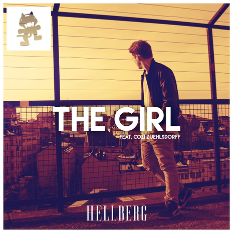
One of Hellberg's most significant singles, 'The Girl' represents his turning point from conventional electronic music. 'The Girl' is Hellberg's start to finding his preferred sound designs and rather than follow the conventions of the electronic genre, Hellberg begins to explore numerous genres for his desired sound.
The initial cover art consists of; the title(with feature), the artist's name, the artist and the town in the background.
The consumer's attention is automatically directed towards the title within the centre shot. Consisting of a simplistic design, the text for 'The Girl' is positioned to represent the song is of greater importance than anything else, artist included.
Hellberg's audience can automatically associate him to the cover through the consistent font use in many of his alternate covers. The branded text allows the artist to encourage fans to return to his music, through recognition, as well as ensure that newcomers will associate that image to Hellberg.
The character within the foreground of the cover is evidently, Jonathan, Hellberg himself. Even though the artist is looking into the distant away from the camera, the consumer can still get a good idea of what the artist looks like. Additionally, the combination of the title and the artist develops a sense of individualism:
'The Girl' is evidently portrayed as one girl from a third person perspective.
The use of 'The' can be interpreted as an emphasis on the individual in which dissociates from possessiveness. (The same idea was used by Willa Cather but to the opposite effect: Cather changed the title of her novel from 'Antonia' to 'My Antonia')
'The Girl' can also represent authentic love ideologies similar to that of 'The One' (as if to say 'the girl' is the one).
Hellberg looking off into the distance develops a sense of drama. His body position of him leaning against a fence is suggestive of patience in which can be interpreted that the character is waiting for something/one.
The colour scheme is quite limited developing themes of isolation and restriction yet still proves considerably effective. Paired with high contrast and a sepia tone; the cover art is visually pleasing.

An alternate version of the first cover art; there are many similarities between the two covers...
'The Girl' is still within centre shot with the featured artist just below. This again can be interpreted that the artist believes that the music is more significant than the artist.
Hellberg's signature font is in the same position to that of the previous cover art.
However rather than the artist within the cover art, the consumer is presented to what appears to be a female. The consumer can then associate the title to the presented character.
The colour scheme consists of some similarities but this cover has significantly darker lighting.

Hellberg's EP (Extended Play) Cover contrasts to the ideologies of his previous covers. Hellberg's convention to make the music more significant than the artist has been broken and for contextual reasons. In 2014, Jonathan Hellberg was unable to work on projects due to an incident in which forced him in and out of hospital. During such time, Hellberg experimented with sound and explored numerous genre to discover his own style. Hence, why in this cover, Hellberg is depicted very clearly using the rule of thirds. It can even be interpreted that the artist is conveyed equally to the music (possibly conveyed to be greater, even).
The colour scheme still follows with Hellberg's conventions of his cover album, considerably limited and in a sepia tone. The lighting however is exaggerated to the extent that the image appears to be over-exposed. This is often used to represent a dream-like effect.
Hellberg's signature font is used in the 1st third (upper)[using the rule of thirds]

Hellberg's Synchronise cover art contrasts to all of his previous covers for numerous reasons:
The image itself has not been manipulated, conserving a raw, true version of the artist.
The lighting is neither over-exposed or considerably darkened. It could be interpreted that the music itself consists of a tired genre hence the lack of colour.
Jonathan Hellberg is conveyed in centre shot with satisfactory lighting. Considering Hellberg's EP cover; the artist could believe that his music follows his own developed style. This is why Hellberg is depicted in a number of his recent album and single covers.
Hellberg's signature font is replaced with a small banner at the bottom of the art with all the details consisting of; artist, song title, featured artist, record label logo and registered serial code.
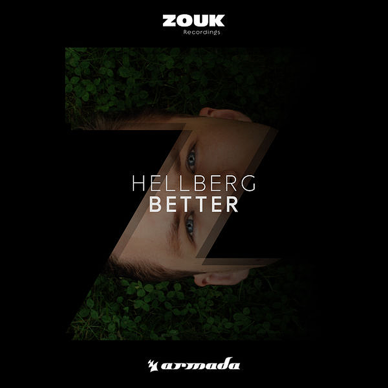
Most of Hellberg's covers consist of him partnered with the MonsterCat label. It may not be forgotten that he is also partnered with Zouk Records.
It is noticeable that the 'Z' in the cover art is a reference to the record label; Zouk Records. Zouk records have clearly influenced the art design with the use of 'Z' which contrasts to MonsterCat in which they only put a sticker on the cover.
Hellberg's signature logo is absent from the cover which could convey that most of his income originates from MonsterCat.
The design itself is clearly more abstract than the MonsterCat designs. The artists face is partly covered and the transparency of the 'Z' shows the artist is laying down on some field (possibly).

The AIR event was a MonsterCat event during the summer in which the three artists; Hellberg, Teqq and Taylr Renee, collaborated and produced a mix called 'Back To Summer'
The poster is visually pleasing in terms of the colour scheme. The rich blues reflect nicely with the silhouetted female and the faint city background. The high contrast and rich colour is highly effective at attracting the consumers attention. The colour scheme, blue, is also connotative to air particles in which they reflect blue light.
The poster is also quite enigmatic due to the silhouetted female within the poster in which could intrigue the audience to pursue the resolution.
The composition of the poster, correlating to Hellberg's album covers, suggests that the event is more important than the artists; returning to Hellberg's original conventions. This is evident as the text 'AIR' is one of the most 'attention-grabbing' aspects of the poster (the second being the silhouetted female).
2 INDIVIDUAL DRAFT ANCILLARY TASKS
(Task 2.6)

The first of the two ancillary tasks, I felt a digipak would enable me to be quite creative due to my previous work with digital art and my album art for Felix 'Fun' Tempus. The structure I decided consisted of a 6 panel digipak with a tube pocket on panel 'A'. The tube would allow a small booklet to be placed within the pocket in which the booklet would display the songs and information about Hellberg.
The dimensions are given within the diagram.

Panel 'A': Outside (Back): Essentially the front of the Digipak, this panel has the intention to attract the intention of the consumer. Conventions from other album covers from Hellberg are consistent within the design. The title of the piece is in centre shot with feature artist below. This was obtained from Hellberg's 'The Girl' album cover. Additionally, Hellberg's signature font is at the bottom of the panel in which the consumer can quickly associate the digipak to the artist.

Panel 'A': Inside (Front): On the other side of panel 'A', a small biography of the artist is given to provide context. This is paired with the booklet in which provides an explanation to the album while also giving relevance to Hellberg's 'This Is Me' and how the chosen songs effectively portray his sound design and style.

Panel 'B': Outside (Back): List of the chosen songs for the album. They provide an effective range of Hellberg's work spanning out over 4 years. Most of the songs within the list are also mentioned previously in the coursework.

Panel 'B': Inside (Front): The other side of panel 'B' shows the CD art consisting of a clock face with roman numeric. This links to the lyrics of the main song: Synchronise. Hellberg's logo is also on the disc to associate emphasise the association of the artist to his music.

Panel 'C': Outside (Back): The artist himself is depicted hear in which he is surrounded by snippets of his lyrics that gives relevance to the time semantic field

Panel 'C': Inside (Front): On the other side of panel 'C', the artists logo is simply present.

The second of the two ancillary tasks, I decided to design a marketing poster for the EP (Extended Play).
As Hellberg only has one poster for an event, I've attempted to construct his style based on his font. This is because there are not enough examples to gather the conventions of the artist's poster.
The MonsterCat logo at the top of the poster suggests the chosen record label due to the higher amount of publicity the company gets than Zouk Records.
The geometric pattern within the poster consists of the template in which multiple photos will be layered, almost creating a smashed mirror effect.
Hellberg's signature logo is within centre shot because of the same contextual reason for his 'This Is Me' EP (The tracks within the 'Pendulum' EP effectively shows his style, hence why he is in centre rather than the EP's name).
The name of the EP is underneath the artist in which the consumer can associate the corresponding name to the EP.
Although the name of the EP is still in speculation, the intention was to connote time by referring the pendulum of a grandfather clock.
The fog in the background helps provide contrast through the poster rather than just a black box.
The text : 'COMING SOON' is identical to that of Hellberg's 'This Is Me' EP. The font consists of: ADAM.CG Pro (Regular)
The platforms displayed below consist of the same platforms the AIR event was digitally distributed to.
VLOG NO.4
(Task 2.7)
You are about to plan and shoot. What is important? How do you feel?
PLANNING
LOCATION
(Task 3.1)

Margate seafront, east of the Winter Gardens

Overhead view of Margate seafront, east of the Winter Gardens
Fort Promenade at Margate seafront would consist of a satisfactory lip-syncing location. Its isolation would ensure a minimal amount of interruptions and is visually pleasing due to its symmetry of the fort.

Overhead view of Worth Farm.
Our first option for the conceptual segments. One of the warehouses at Worth farm can perfectly portray a dark environment.

Overhead view of abandoned facility in Sandwich.
Our second option for the conceptual segments. An abandoned structure by the railway, this would be perfect for the conceptual segments due to the nature of the location. Although we may have to wait till after dark to capture the darkened themes.
COSTUME
(Task 3.2)

Maks' Formal Wear

Maks' Informal Wear

Ethen's Formal Wear
PROPS
(Task 3.3)
Microphone & Stand
The microphone is predominantly going to be used within the performance aspects of the music video.
Pack of Cards
The pack of cards is the prop that is tied to the reverse elements. During the conceptual segment where the two dancers are portrayed. The cards will rise from the ground when the reverse technique has been applied.
Guitar
The guitar, again, will be used during the latter parts of the performance. Although this is not certain, the guitar will add more content to the performance aspects.
CASTING
(Task 3.4)
Player 1: Maks Waldoch (Male Actor); With Maks' formal wear we are able to effectively portray a darkened figure within the conceptual segments. Additionally, the lack of colour works perfectly with Maks' tall stature and will contrast quite nicely with the planned third character. However during the narrative sequences, Maks' other costume changes to generic casual.
Player 2: Ethen Dent (Male Performer); With knowledge of the song, Ethen is conveniently our lip-syncer due to him memorising the lyrics. Paired with his formal wear and improvisation, Ethen can effectively capture the performing segments and display a convincing performance.
Player 3: Shannon Townshend (Female Actor); With Shannon's formal wear, we are able to effectively portray a considerably more colourful figure into the conceptual segment. Being the second actor within the concept and narrative segments, Shannon effectively provides colour and contrast to that of our first actor; Maks.
SHOT LIST
(Task 3.5)

RISK ASSESSMENT INFO
(Task 3.6)
PRODUCTION
ASSEMBLE EDIT
(Task 4.1)
PROGRESS EDITS
FINAL CUT
(Task 4.3)
ANCILLARY TASKS
ANCILLARY TASK 1: MY DIGIPACK
(Task 5.1)


CONSTRUCTION
Panel 'A' Back (Front Cover)
1. The initial stages of the digipak started from the construction of a geometric design in which was inspired from Varien's 'Ancient and Arcane' album cover. Although significantly more simplistic at the start of the design, the centre cross would soon be used to implement a more complex pattern within the centre of the diamond. The geometric design would allow the digipak's front cover to have two contrasting images within a similar semantic field; the use of space and time.
2. The more complex pattern within the centre of the geometric design is drawn. This is completed by using the centre cross and the diamond to connect dots between points where the lines either meet or intercept. This is used to act as a template in which an image would be cut up into the shapes to create a broken glass effect.
3. Imported desired picture in which would be 'fragmented' at a later stage within the construction. Scaled to the appropriate size.
4. First fragment of the selected photo is applied to the geometric design. This is achieved by cutting around the selected area, copy and pasting within the shape and then merging down to a transparent layer and then placing behind the geometric pattern.
5. Slightly move image and then repeated the process until this has been achieved for all the shapes within the pattern. This gives the broken glass effect. Slight movement involved; traversal across x-coordinate, traversal across y-coordinate, rotation, horizontal flip, scale.
6. Imported Hellberg's signature logo onto the front of the digipak and also applied a erratic sketch overlay to increase the impact of the logo. This is conventional among Hellberg's recent covers as his new found style (2015) was the start of portraying himself as equal importance to the music, hence why Hellberg's logo is within centre shot and to a considerable size.
7. Added a background of a nebula behind the geometrical pattern and the numerous fragments. Changed multiple shades of red into an 'alpha channel' in order to get a specific colour scheme for the digipak cover. Added contrast to the background. Applied Gaussian Blur to the background. Added a black background to manipulate the alpha channels into the colour black. Applied cloud filter. Applied heavy contrast and darkened lighting to the cloud filter. Used colour correction to emphasize blue(s) and magenta(s).
8. Imported Monstercat logo. Imported Hellberg's 'This Is Me' Barcode. Rescaled both images to appropriate size, similar to that of Varien's 'Ancient and Arcane' album cover. Constructed an outline to join the two images together. Increased colour saturation and lowered brightness in order to portray a colour. Adjusted HUE values to desired colour that fitted the colour scheme.
9. Add additional details. Added text of the EP's title; 'PENDULUM'. Added text; 'Extended Play'. (Chosen font consists of ADAM.CG PRO)
10. Tweaks added to the design: Sharpened geometrical design. Removed Centre Cross. Remapped all of the fragments to avoid gaps in the image. Inverted the colour scheme of the geometrical pattern to make the glass effect a little more subtle.
Panel B (Back Cover)
1. Imported the design from the front cover
2. Scaled the geometrical design so in which the text of the song list is capable of fitting the diamond.
3. Added the text consisting of the song list.
Panel C Back (First Inner Cover)
1. Imported the design from the front cover
2. Imported Hellberg image into photo manipulator.
3. Cut around Hellberg to make everything around the artist into an alpha channel.
4. Applied the same 'fragmentation' process to the artist's image; cut around the artist using the geometrical design as a template and then slightly move for each individual shape.
5. Imported Hellberg's logo and then scaled to the desired size. Overlay an erratic sketch to increase impact of the logo.
Panel A Front (Inside of left panel)
1. Imported geometrical design and then rotated 45 degrees for slight variation to outside covers. Inverted colour scheme to turn the white design into black.
2. Imported background image from Panel A design.
3. Created a background image in which the inner square would consist of a black background, to make the alpha channels into the colour black, and the outer frame would consist of a white background, to make the alpha channels white.
4. Added a text description, obtained from the Monstercat wiki. Text consists of ADAM.CG PRO.
5. Added title: PENDULUM. Text consists of ADAM.CG PRO.
Panel B Front (Intray)
1. Imported the same nebula picture used throughout the digipak. Scaled and repositioned to desired size and place.
2. Changed shades of red into alpha channels to develop the correct colour scheme. Replaced alpha channels with the colour white by changing the background colour to white.
3. Sharpened the image. Increased contrast and decreased brightness.
Panel C Front (Inside of the Right Panel)
1. Imported the background image from the Intray (Panel B Front).
2. Imported the geometrical design from Panel A Front
3. Imported an image of each of the character within the music video.
4. Measured the length of the inner square from the geometrical design. Inner square: 2242 pixels wide. 2242 / 4 = 560.5... hence 560.5 pixel length for each image.
5. Cut each image to the desired size of 2242x560.5 pixels and repeated the process for each individual image.
6. Changed each image to greyscale, colourised the image to portray only one colour but at different shades. Repeated the process for each image using a different HUE during the colourising process. Applied contras to each of the images.
Disc (Design)
1. Import design from Panel B (Intray)
2. Imported image of CD. Scaled to 3050x3050 pixels.
3. Removed all colour and removed all brightness to make the CD image black.
4. Highlighted the CD and changed the alpha channels to selection. Highlighted the background image and copy and pasted so the background would be cut into the shape of the CD.
5. Removed initial background image.
6. Added Roman numerics. Added Hellberg's logo to the CD.
Panel 'A' Back (Front Cover)
Panel B Back (Back Cover)
Panel C Front (Inner Cover)
Panel 'A' Back (Front Cover)
Panel B Front (Intray)
Panel C Back (Inner Sleeve, Right)
ANCILLARY TASK 2: MY MAGAZINE ADVERT
(Task 5.2)
FEEDBACK
(Task 5.3)
EVALUATION
MINI ME
(Task 6.1)
PREZI
(Task 6.2)
FEEDBACK VLOG
(Task 6.3)
CHATBACK VLOG
(Task 6.4)
EXTRA
So this page isn't necessary but I felt that I needed to include it, as I have worked on A LOT of extra content within my coursework this year that might get unnoticed. The extra things I have done I will list below as I have worked hard on them.
MUSIC

Some examples of music within my coursework has actually been composed by me, although under an alias. Most prominent within my vlogs, the background tracks, during the talks, tend to be either track 2 of my EP; Culture Shock, or a future release consisting of a chill/ambience track. (the future track is unnamed at the present time) [21/02/17]
(Note: Felix 'Fun' Tempus is not partnered to Monstercat)
(2nd Note: The album cover references Hellberg by using his album code: MCEP072)
The music comes under the alias of Felix 'Fun' Tempus in which was created within one of our media lessons on collective identity. This progressed into a project in which the idea of an artist actually became an artist. I loved the idea of Felix, I adopted it as the alias in which I would post my music (rather than post it on my generic channel).

PHOTOGRAPHY
One of my new-found hobbies is photography. I've only recently picked this up and has practiced my use of cinematography and mise-en-scene considerably. A couple of the photos I've taken this year have been the banners at the top of each page of my coursework and I feel that it ties it together really nicely, not to mention looks quite professional.
What I’ve been listening to:


Comments