
OddWatch Art Direction: Typography
- Ethen Dent

- Nov 22, 2021
- 1 min read

Typography
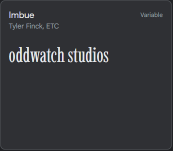
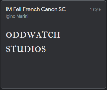
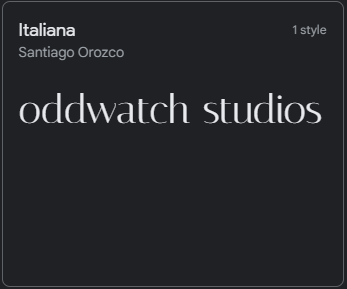
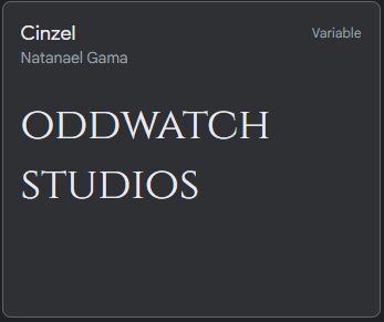
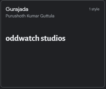
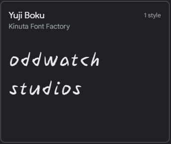
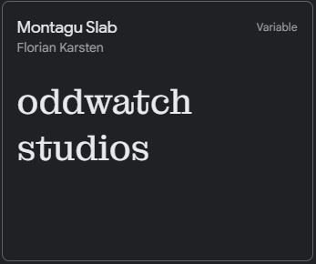
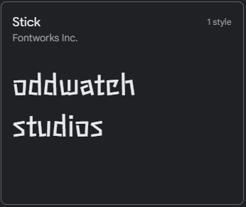
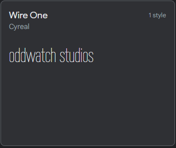
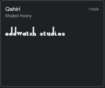
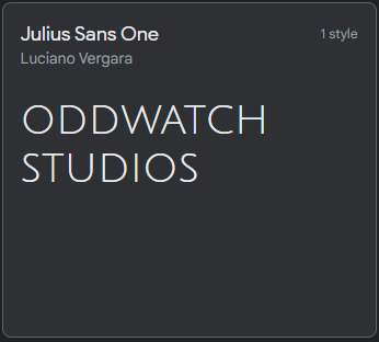
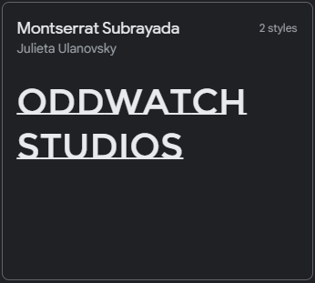
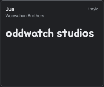
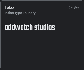
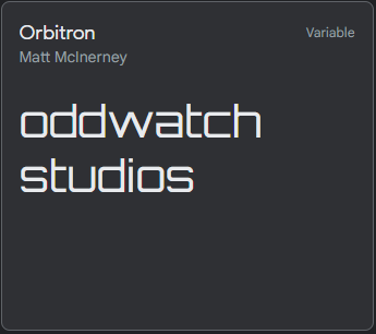
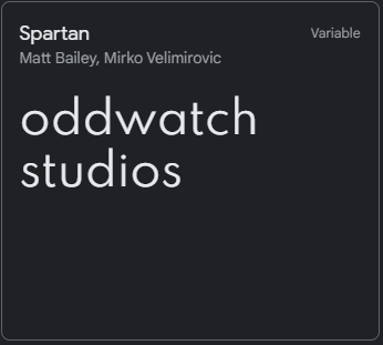
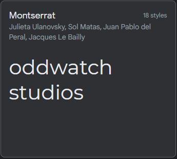
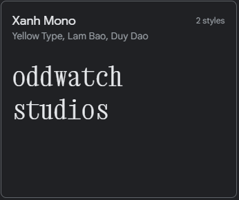
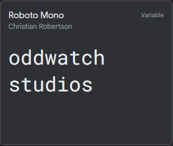
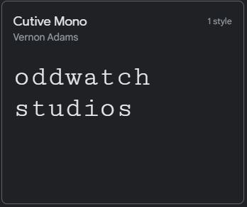
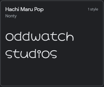
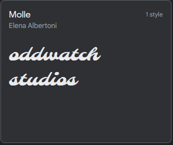
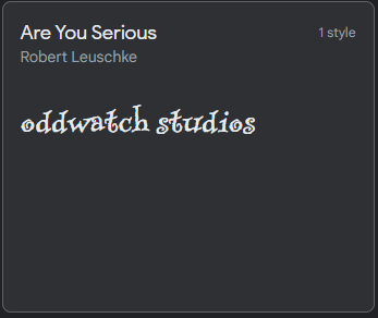
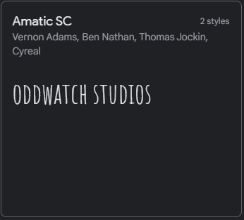
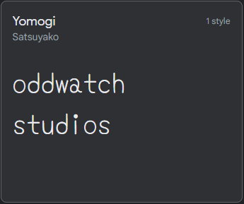
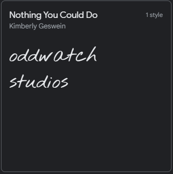
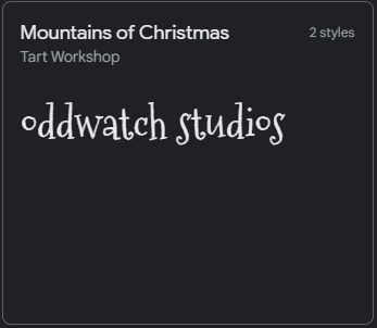
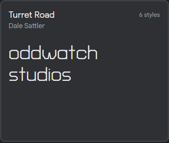
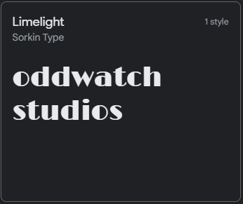
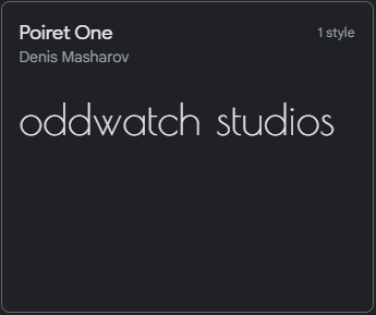
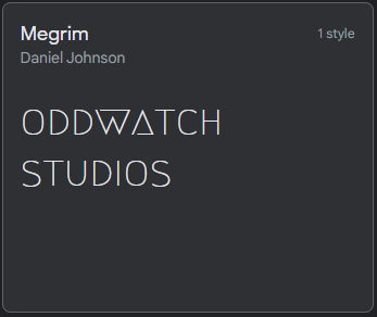
Typography is an important aspect of branding. After covering typography in class, I wanted to follow through and implement the content covered into OddWatch. This exercise involved browsing Google Fonts and picking any favorites with each different typeface (Sans, Sans Seriff, Display, Handwriting, Monospace). Afterwards, each font would be placed alongside the logo and shown to my peers. I conducted this part of the exercise to get multiple perspectives of the logo and typeface together in one graphic. This is the second time I have done this research as I have also done this for NVRT studios, a previous idea.


Implementing Typography
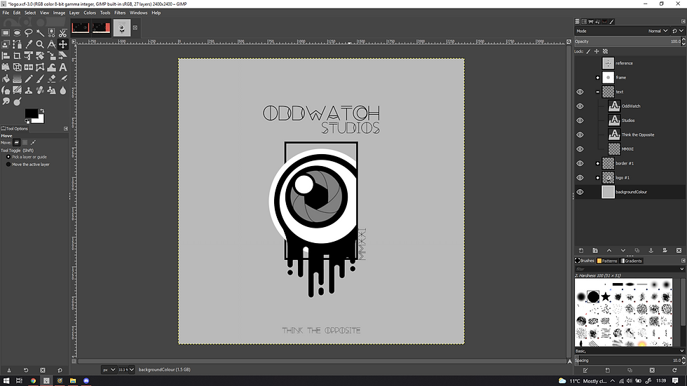
"Try getting the black drip to be in line with the black outline and it might be worth looking at different typography, you can match overly complicated type with some simple type, serif with sans serif e.c.t. I like it tho it looks good but i'd check out type more, the type goes with it but for the logline maybe have a simpler text. https://fontjoy.com/ - that a good website for it Basically they'll go if they're very similar or if they're heavily contrasting https://www.fontpair.co/ - another one for you" - Jess Hiles

Reflection Segment
I’m still uncertain about the typeface I am currently using for the brand. I may ask for some additional feedback before the end of my short term strategy deadline passes.
What I've been listening to:

Comments