
OddWatch Art Direction: Branding
- Ethen Dent

- Nov 19, 2021
- 2 min read

Logo v1.0
The following images depicts various iterations of the logo development process. It is the first art piece so far that represents the brand.

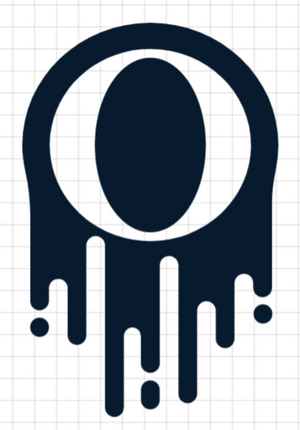


[OddWatch Studios - Logo Glitch Render v001]
The Stepping Stones
Getting to the final iteration of the logo, or at least v1.0, took hundreds of attempts and various resources. This included logo generators and typeface libraries.


1. Simplistic, all capital logo w/ slogan - I interpret this logo to convey a simplistic shoe/fashion brand intended to target young teens/adults. Perhaps intending to sell sports apparel. Difficult to determine the separation of ':NVRT' and 'studios' at a glance. 2. Simplistic, all capital logo w/o slogan - I interpret this as a lazy digital art project. Oversimplified and tells no story as a brand. 3. All capital typography w/ slogan & logo - I interpret this as more of a games logo. Good typography with clear text. The overall format is quite pleasing. 4. Geometric logo w/ est. year - I associate the colour scheme more with a coffee brand. The geometry looks decent as well as the shapes on either side. 5. All capital typography w/ pseudo lower case and geometric logo - I interpret this closer to my intended message. The geometric logo is two squares layered on top of itself, drawing similarities to the compositing diagram at Escape. Creative typography. Easy to determine ':NVRT' to 'studios' 6. Book/Film logo - correctly conveys the message that are brand associates with (researching and productions) 7. Cube logo - correctly conveys the procedure that the business idea intends (3D productions). The logo draws similarities to the 3D VFX diagram at Escape. 8. Pseudo-3D logo - reminds me of the Playstation logo during the PS1 era. 9. Glitch square logo - I like the glitch effect of the logo and it fits the message of breaking from the norm. 10. Glitch hexagonal logo - different geometry to the previous design. 11. Glitch cubic logo - not sure on the strong 3d effect that has been applied to both the text and geometry. But I do like the cubic geometry itself. Typography is below average. Not a fan of the font and the use of lower case typography. 12. Glitch geometric logo - This, in my opinion is the best of the glitch logos that I have found. An inverted colour scheme for the middle square is a perfect idea for logo design for my business.


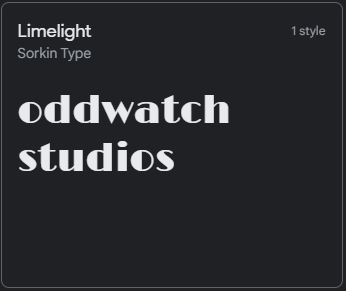
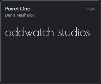
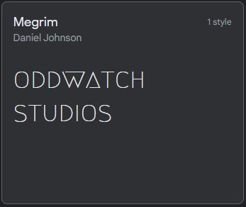
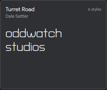
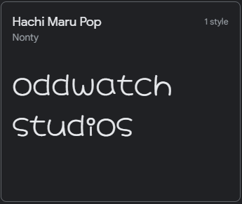
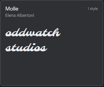
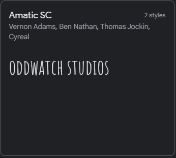
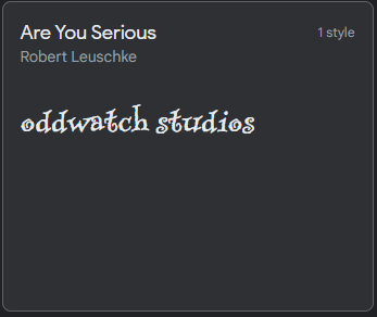
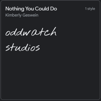
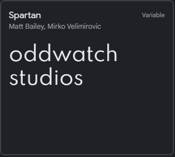
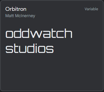
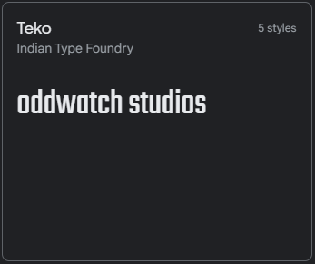
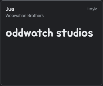
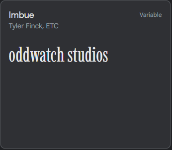
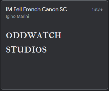
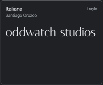
Typeface
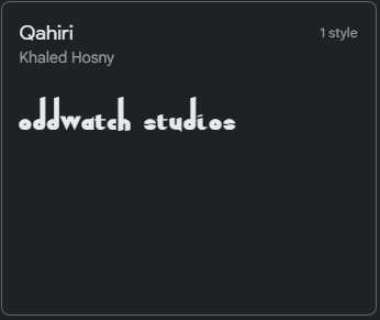
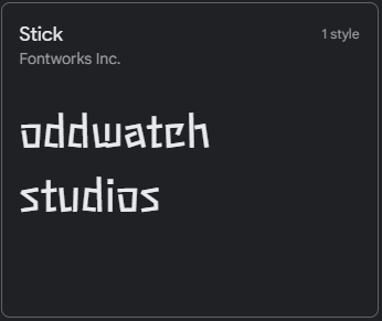
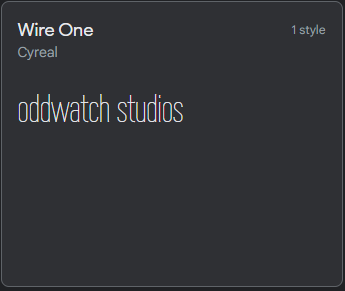
Display


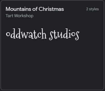

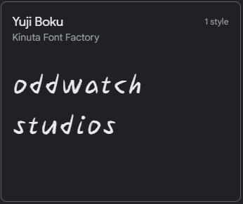
Handwriting


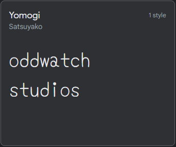

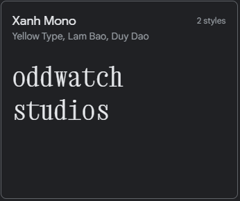
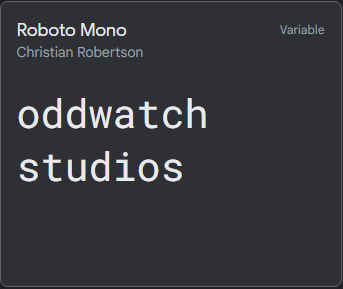
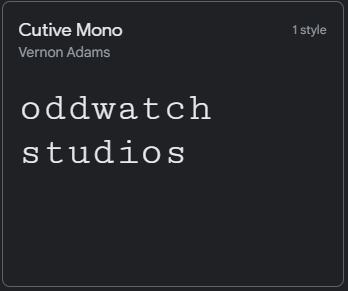
Monospace


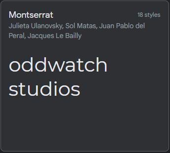
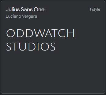
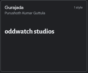
Sans Seriff


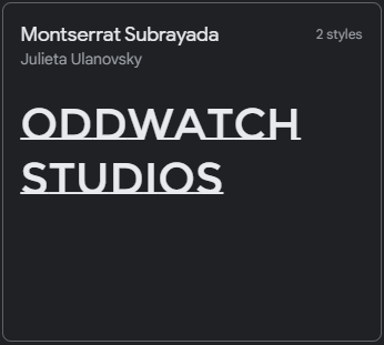
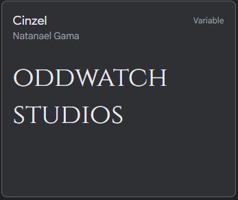
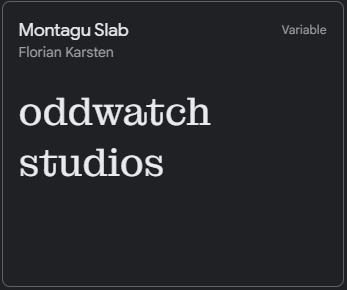
Seriff


Citations
(no date) Google fonts. Google. Available at: https://fonts.google.com/ (Accessed: November 29, 2021). What I've been listening to:


Comments